One of the most stressful parts of booking a photography session is what the heck to wear in front of the camera! Though I solve this problem with my client closet for my own clients, if you’re shooting with another photographer or want to know how to dress your own family, here are some of my favorite fall color palettes. It will definitely help you solve the problem of what to wear for your Austin fall family photos!

Let’s take a minute to break down each of these looks!
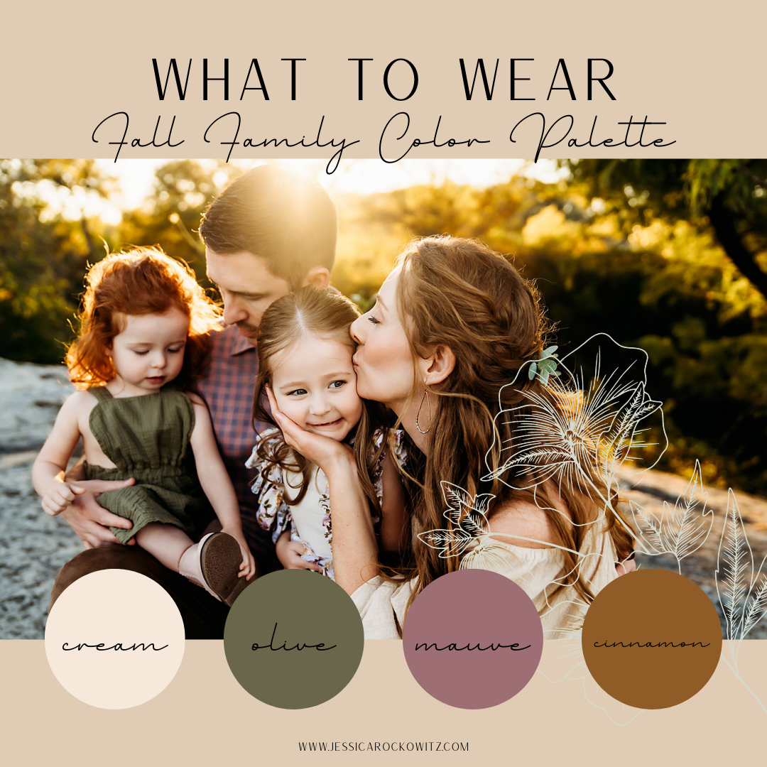
Look #1: Cream, Olive, Mauve and Cinnamon
Why We Like It: Colors opposite on the color wheel are called “complimentary colors” and tend to pair well together. Olive and mauve are such colors! Cream and cinnamon are neutral enough to tie into this beautiful palette, making it the perfect earthy vibe with a pop of color.
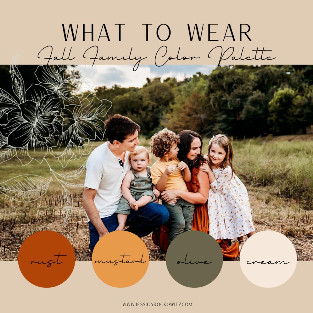
Look #2: Rust, Mustard, Olive, and Cream
Why We Like It: Just like the first palette, we find that rust and olive are opposite on the color wheel, thereby becoming pleasing to the eye as complimentary colors. Being warmer tones, mustard is the perfect third warm tone that is neutral enough to blend in nicely with this warmer palette while still giving it a nice pop. Cream is the perfect finish to tie in neutrality so we aren’t overloaded with color.
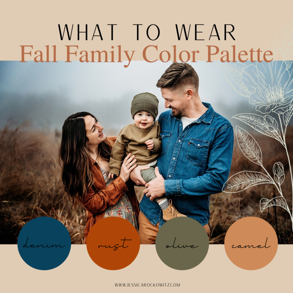
Look #3: Denim, Rust, Olive, and Camel
Why We Like It: By now you’re pretty well versed on complimentary colors! Rust is opposite on the color wheel to both olive and denim, but this palette is extra special because denim actually acts as a neutral! Though blue is not a tone that we can pair with all palettes, denim goes with mostly all palettes and acts as a neutral when selecting outfits. Camel is the perfect earth tone to round out this well balanced palette.
Wondering Where to Shop?
Here are some of my fall favorites!
For the mamas…
For the dads…
For the kiddos…
Which palette do you like best? Do you have a better sense of what to wear for your Austin fall family photos?


